Showcase Gallery
Contents
Showcase Gallery#
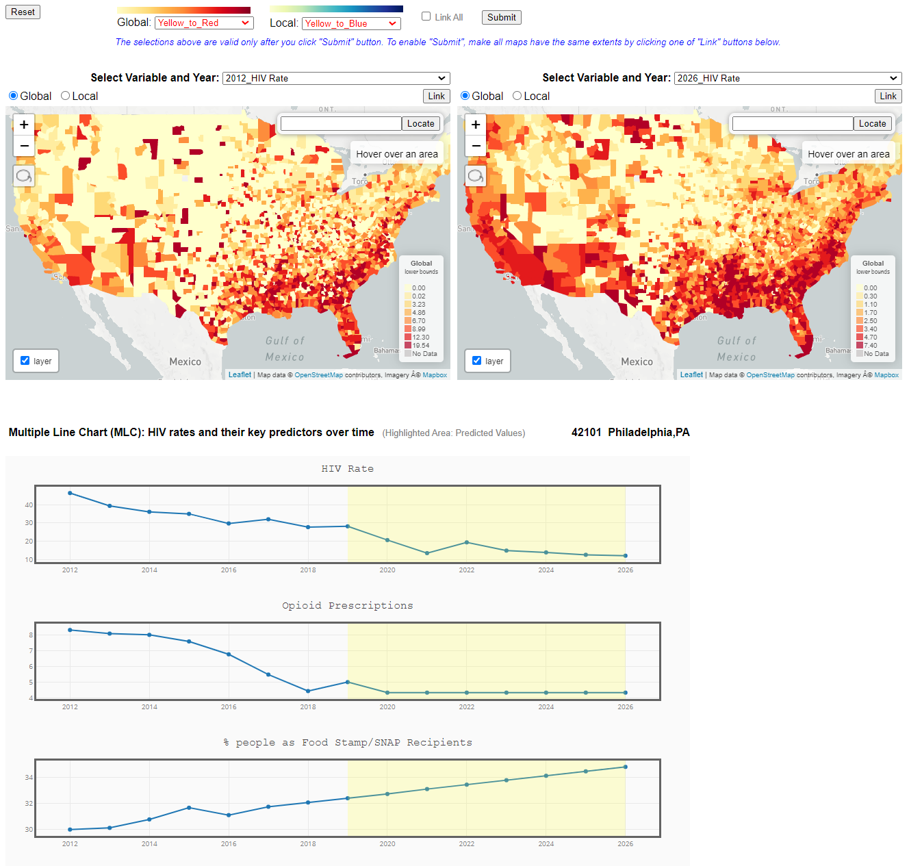
Multiple Linked Chart (MLC)#
- HIV rates and their key predictors over time.
Click to try out https://cybergis.illinois.edu/cybergis-hiv-gallery/SAM_HIV_MLC/
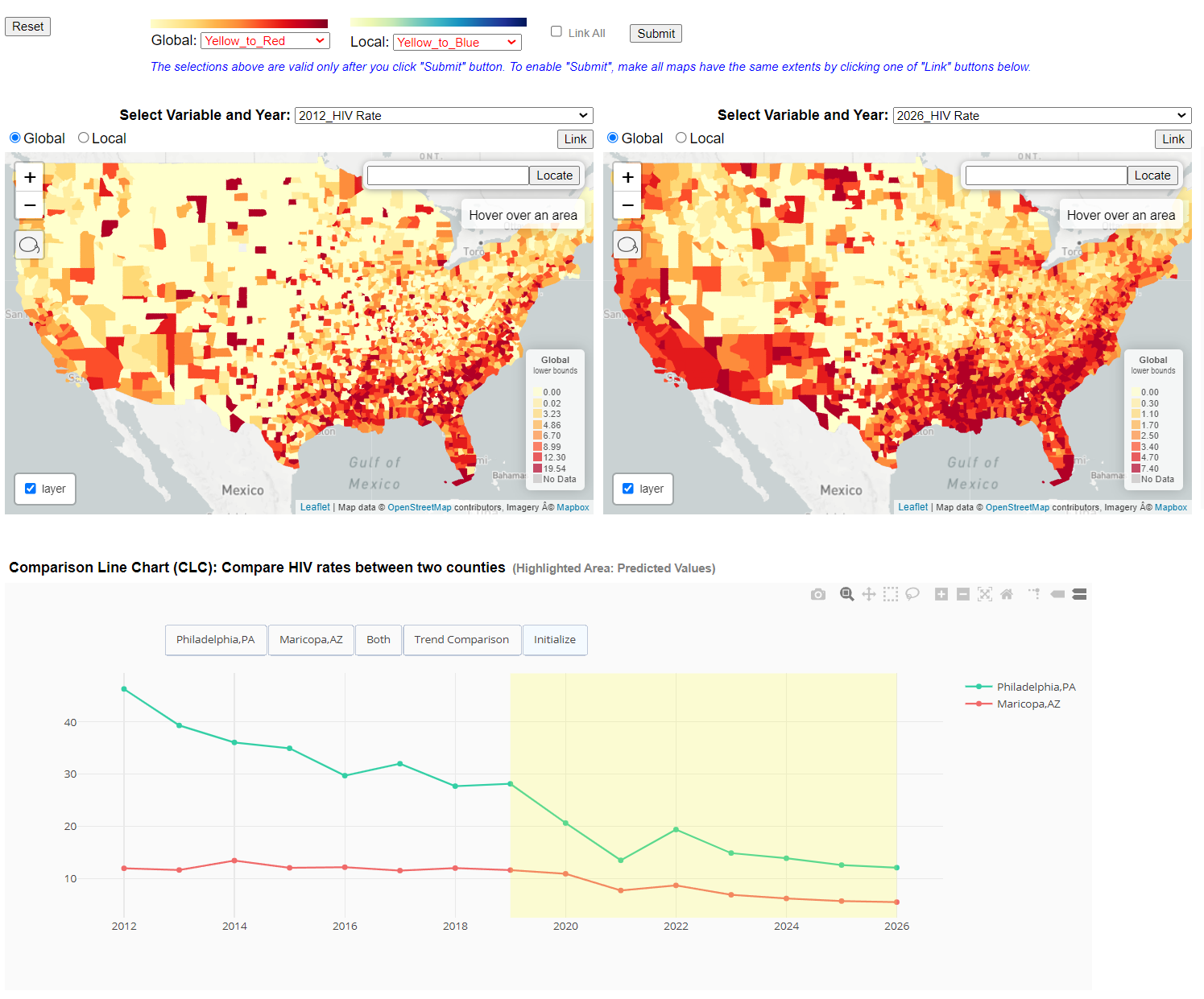
Comparison Linked Chart (CLC)#
- Comparison of HIV rates between two US counties.
Click to try out https://cybergis.illinois.edu/cybergis-hiv-gallery/SAM_HIV_CLC/
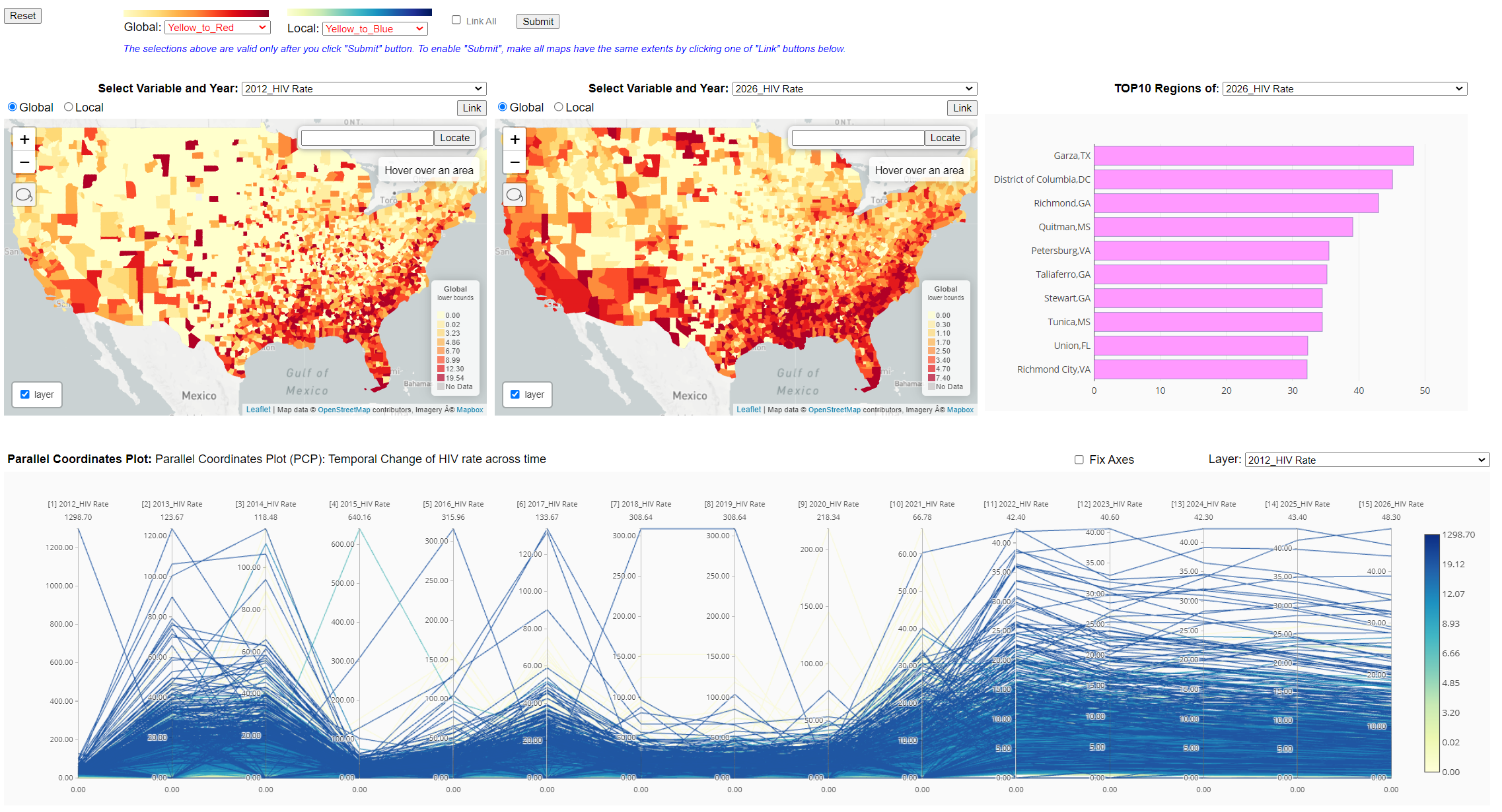
Parallel Coordinate Plot (PCP)#
- HIV rates across time in all or selected US counties.
Click to try out https://cybergis.illinois.edu/cybergis-hiv-gallery/SAM_HIV_PCP/